
Largest cross-market UX research project @SHOPLINE
Largest cross-market UX research project
Largest cross-market UX research project


🔒 Due to the Non-Disclosure Agreement, certain details will be omitted.
🔒 Due to the Non-Disclosure Agreement, certain details will be omitted.
🔒 Due to the Non-Disclosure Agreement, certain details will be omitted.
Impact
Impact
Impact
Initiated the largest-ever research project, and informed 5 strategic priorities for the upcoming product roadmap
Initiated the largest-ever research project, and informed 5 strategic priorities for the upcoming product roadmap
Initiated the largest-ever research project, and informed 5 strategic priorities for the upcoming product roadmap
Role
Role
Role
UX Intern
UX Intern
UX Intern
Time
Time
Time
Apr - Jun 2023
Apr - Jun 2023
Apr - Jun 2023
#1 e-com brand (Shopify) in Asia
#1 e-com brand (Shopify) in Asia
#1 e-com brand (Shopify) in Asia
SHOPLINE (my employer) is a platform offering a seamless and engaging shopping experience for users, while empowering merchants to maximize sales and customer engagement.
SHOPLINE (my employer) is a platform offering a seamless and engaging shopping experience for users, while empowering merchants to maximize sales and customer engagement.
SHOPLINE (my employer) is a platform offering a seamless and engaging shopping experience for users, while empowering merchants to maximize sales and customer engagement.


Problem
Problem
Problem
Low promotion visibility led to less sales for our clients
Low promotion visibility led to less sales for our clients
Low promotion visibility led to less sales for our clients
Our recent study showed that 7 out of 8 interview participants didn't even look at the promotional offers. This could potentially lead to our clients losing sales.
Our recent study showed that 7 out of 8 interview participants didn't even look at the promotional offers. This could potentially lead to our clients losing sales.
Our recent study showed that 7 out of 8 interview participants didn't even look at the promotional offers. This could potentially lead to our clients losing sales.
Solution
Solution
Solution
Redesigned promotion module by learning from user buying journey
Redesigned promotion module by learning from user buying journey
Redesigned promotion module by learning from user buying journey
As we haven't unleashed the full potential of merchant GMV (total sales amount), we initiated a robust UX repository to collect research results to empower our data-driven UX decisions.
As we haven't unleashed the full potential of merchant GMV (total sales amount), we initiated a robust UX repository to collect research results to empower our data-driven UX decisions.
As we haven't unleashed the full potential of merchant GMV (total sales amount), we initiated a robust UX repository to collect research results to empower our data-driven UX decisions.
Align business goals w/ PM:
Unlock mutual benefits for customers and merchants
Align business goals w/ PM:
Unlock mutual benefits for customers and merchants
Align business goals w/ PM:
Unlock mutual benefits for customers and merchants
Customers
Customers
Customers
☑️ Better deals
☑️ Better deals
☑️ Better deals
☑️ Seamless shopping experience with clear information
☑️ Seamless shopping experience with clear information
☑️ Seamless shopping experience with clear information
Merchants
Merchants
Merchants
☑️ Effective promotion to boost sales
☑️ Effective promotion to boost sales
☑️ Effective promotion to boost sales
☑️ Customer loyalty improvement
☑️ Customer loyalty improvement
☑️ Customer loyalty improvement
SHOPLINE (my employer)
SHOPLINE (my employer)
SHOPLINE (my employer)
☑️ GMV enhancement
☑️ GMV enhancement
☑️ GMV enhancement
☑️ Solid brand reputation
☑️ Solid brand reputation
☑️ Solid brand reputation
Our process to reach the goals: research backed design
Our process to reach the goals: research backed design
Our process to reach the goals: research backed design


To define our research scope:
How might we better communicate the relevance of promotions to users which drives purchase decisions?
To define our research scope:
How Might We better communicate the relevance of promotions to users which drives purchase decisions?
To define our research scope:
How Might We better communicate the relevance of promotions to users which drives purchase decisions?


How we answered questions through primary research
How we answered questions through primary research
How we answered questions through primary research


1
Recruitment & Pilot Test
1
Recruitment & Pilot Test
1
Recruitment & Pilot Test
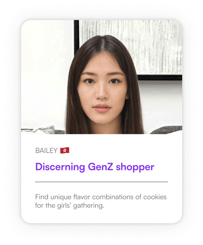
Build a common understanding of users within our team
Build a common understanding of users within our team
Build a common understanding of users within our team
Proto personas provide a starting point for user-centered design, and guide who we recruit for the upcoming user testing.
Proto personas provide a starting point for user-centered design, and guide who we recruit for the upcoming user testing.
Proto personas provide a starting point for user-centered design, and guide who we recruit for the upcoming user testing.


Create design iterations based on secondary research data
Create design iterations based on secondary research data
Create design iterations based on secondary research data
We leverage insights from UX audits, customer support interactions, and relevant online resources to hypothesize user needs with PMs, and turn into new designs.
We leverage insights from UX audits, customer support interactions, and relevant online resources to hypothesize user needs with PMs, and turn into new designs.
We leverage insights from UX audits, customer support interactions, and relevant online resources to hypothesize user needs with PMs, and turn into new designs.


Invite selected internal staff instead due to resource constraints
Invite selected internal staff instead due to resource constraints
Invite selected internal staff instead due to resource constraints
Recognizing the limitations of internal participant recruitment, we selected staff from Hong Kong/Taiwan based on the screening survey results to minimize bias.
Recognizing the limitations of internal participant recruitment, we selected staff from Hong Kong/Taiwan based on the screening survey results to minimize bias.
Recognizing the limitations of internal participant recruitment, we selected staff from Hong Kong/Taiwan based on the screening survey results to minimize bias.
☑️ Online shopping habits At least once in every 3 months
☑️ Online shopping habits At least once in every 3 months
☑️ Online shopping habits At least once in every 3 months
☑️ No prior relevant project experience Exclude designers also
☑️ No prior relevant project experience Exclude designers also
☑️ No prior relevant project experience Exclude designers also
Test new design in pilot runs first
Test new design in pilot runs first
Test new design in pilot runs first
Pilot tests help us assess the feasibility of the research plan, and ensure the chosen methodology effectively gathers the desired information.
Pilot tests help us assess the feasibility of the research plan, and ensure the chosen methodology effectively gathers the desired information.
Pilot tests help us assess the feasibility of the research plan, and ensure the chosen methodology effectively gathers the desired information.
2
Methodology
2
Methodology
2
Methodology
Usability test + UEQ: focus on comprehension
Usability test + UEQ: focus on comprehension
Usability test + UEQ: focus on comprehension
Participants are expected to complete purchases over 2 new designs of online store on both desktop and mobile phone.
Participants are expected to complete purchases over 2 new designs of online store on both desktop and mobile phone.
Participants are expected to complete purchases over 2 new designs of online store on both desktop and mobile phone.
Semi-structured interview
Semi-structured interview
Semi-structured interview
Compare 2 designs and the current launched site to learn:
Compare 2 designs and the current launched site to learn:
Compare 2 designs and the current launched site to learn:
initial expectations
perceived differences
preferences on the style of promotions
initial expectations
perceived differences
preferences on the style of promotions
initial expectations
perceived differences
preferences on the style of promotions
Desirability test: focus on sentiment
Desirability test: focus on sentiment
Desirability test: focus on sentiment
Help Expected impacts include:
Help Expected impacts include:
Help Expected impacts include:
Help participants describe their emotional responses
Use quantitative data to spot crucial signal during transcribing perceived differences
Help participants describe their emotional responses
Use quantitative data to spot crucial signal during transcribing perceived differences
Help participants describe their emotional responses
Use quantitative data to spot crucial signal during transcribing perceived differences
The primary purpose of using quantitive measures under a small sample size was to elicit qualitative feedback and encourage participant discussion, rather than to draw definitive statistical conclusions.
The primary purpose of using quantitive measures under a small sample size was to elicit qualitative feedback and encourage participant discussion, rather than to draw definitive statistical conclusions.
The primary purpose of using quantitive measures under a small sample size was to elicit qualitative feedback and encourage participant discussion, rather than to draw definitive statistical conclusions.
3
Analysis
3
Analysis
3
Analysis
Qual data: thematic analysis
Qual data: thematic analysis
Qual data: thematic analysis
After transcribing 270+ minutes of interview data, we began color-coding and using an affinity diagram to identify sentiments associated with each user flow.
After transcribing 270+ minutes of interview data, we began color-coding and using an affinity diagram to identify sentiments associated with each user flow.
After transcribing 270+ minutes of interview data, we began color-coding and using an affinity diagram to identify sentiments associated with each user flow.


"It would be better if promotions were also highlighted with cart items.
Too cumbersome to compare them scrolling up and down."
"It would be better if promotions were also highlighted with cart items.
Too cumbersome to compare them scrolling up and down."
"It would be better if promotions were also highlighted with cart items.
Too cumbersome to compare them scrolling up and down."
6 out of 8 participants expressed dissatisfaction with the repetition of discount names on the cart page.
But they ultimately preferred having the overall discount section collapsed by default, to be expanded when they need to verify the discount.
6 out of 8 participants expressed dissatisfaction with the repetition of discount names on the cart page.
But they ultimately preferred having the overall discount section collapsed by default, to be expanded when they need to verify the discount.
6 out of 8 participants expressed dissatisfaction with the repetition of discount names on the cart page.
But they ultimately preferred having the overall discount section collapsed by default, to be expanded when they need to verify the discount.


"The free shipping progress bar is harder to ignore. Wanna go and add some other items."
"The free shipping progress bar is harder to ignore. Wanna go and add some other items."
"The free shipping progress bar is harder to ignore. Wanna go and add some other items."
We found that dynamic shipping information and progress bars can positively impact purchase intent. To further enhance the visibility of free shipping options, we explored different UI styles.
Our testing revealed that the bar in the left version was initially perceived as an irrelevant decoration by more users.
Quan data: help integrate best features from both designs
Quan data: help integrate best features from both designs
Quan data: help integrate best features from both designs


The final version incorporates the well-organized information from design A (coded in purple) and visuals from B (coded in orange).
Design A is reported to have higher pragmatic scores in UEQ and positive desirability test results.
The captivating promotional elements are chose from design B is because participant feedback revealed the effectiveness of bright colors and icons in drawing attention to the discount sections.
Selected UX/UI Improvements
Selected UX/UI Improvements
Selected UX/UI Improvements
For customers:
Collapse discount section to increase visibility of other promo
For customers:
Collapse discount section to increase visibility of other promo
For customers:
Collapse discount section to increase visibility of other promo
Reduce the mental strain during confirmation, and allow other promotions stand out.
Reduce the mental strain during confirmation, and allow other promotions stand out.
Reduce the mental strain during confirmation, and allow other promotions stand out.


For SHOPLINE:
Free shipping progress bar to enhance Average Order Value (AOV)
For SHOPLINE:
Free shipping progress bar to enhance Average Order Value (AOV)
For SHOPLINE:
Free shipping progress bar to enhance Average Order Value (AOV)
Easily see how close they are to qualifying for free shipping, encouraging them to confidently add more items.
Easily see how close they are to qualifying for free shipping, encouraging them to confidently add more items.
Easily see how close they are to qualifying for free shipping, encouraging them to confidently add more items.
For merchants:
Leverage color psychology and icons to boost purchase intent
For merchants:
Leverage color psychology and icons to boost purchase intent
For merchants:
Leverage color psychology and icons to boost purchase intent
Create a sense of value and urgency, prompting the "it's a steal" perception
Create a sense of value and urgency, prompting the "it's a steal" perception
Create a sense of value and urgency, prompting the "it's a steal" perception


Impacts on UX, collaboration, and roadmap
Impacts on UX, collaboration, and roadmap
Impacts on UX, collaboration, and roadmap
Cross-functional team collaboration
Cross-functional team collaboration
Cross-functional team collaboration
Initially skeptical about investing in promotion engagement research, the product lead embraced a new approach after the design manager proactively invited PMs to join usability sessions.
Observing user behavior and engaging in real-time discussions facilitated open communication and bridged the gap between PMs and the design team, even in the Q&A part of our meeting, the product lead commented:
"I am looking forward to what you concluded in the report about the next. That would definitely help the team to achieve our annual goals."
"I am looking forward to what you concluded in the report about the next. That would definitely help the team to achieve our annual goals."
"I am looking forward to what you concluded in the report about the next. That would definitely help the team to achieve our annual goals."
—— Product manager
—— Product manager
—— Product manager
Customer & client satisfaction
Customer & client satisfaction
Customer & client satisfaction
Better experience means higher reputation for merchants and Shopline.
We have data-driven design proposal to lower down confusion at checkout, and increase purchase intent with UI changes.
Better experience means higher reputation for merchants and Shopline.
We have data-driven design proposal to lower down confusion at checkout, and increase purchase intent with UI changes.
Better experience means higher reputation for merchants and Shopline.
We have data-driven design proposal to lower down confusion at checkout, and increase purchase intent with UI changes.
Top 5 Feature Enhancements Prioritized
Top 5 Feature Enhancements Prioritized
Top 5 Feature Enhancements Prioritized
Provide prioritized details to support the execution to reach quarter goal of boosting GMV
Provide prioritized details to support the execution to reach quarter goal of boosting GMV
Provide prioritized details to support the execution to reach quarter goal of boosting GMV


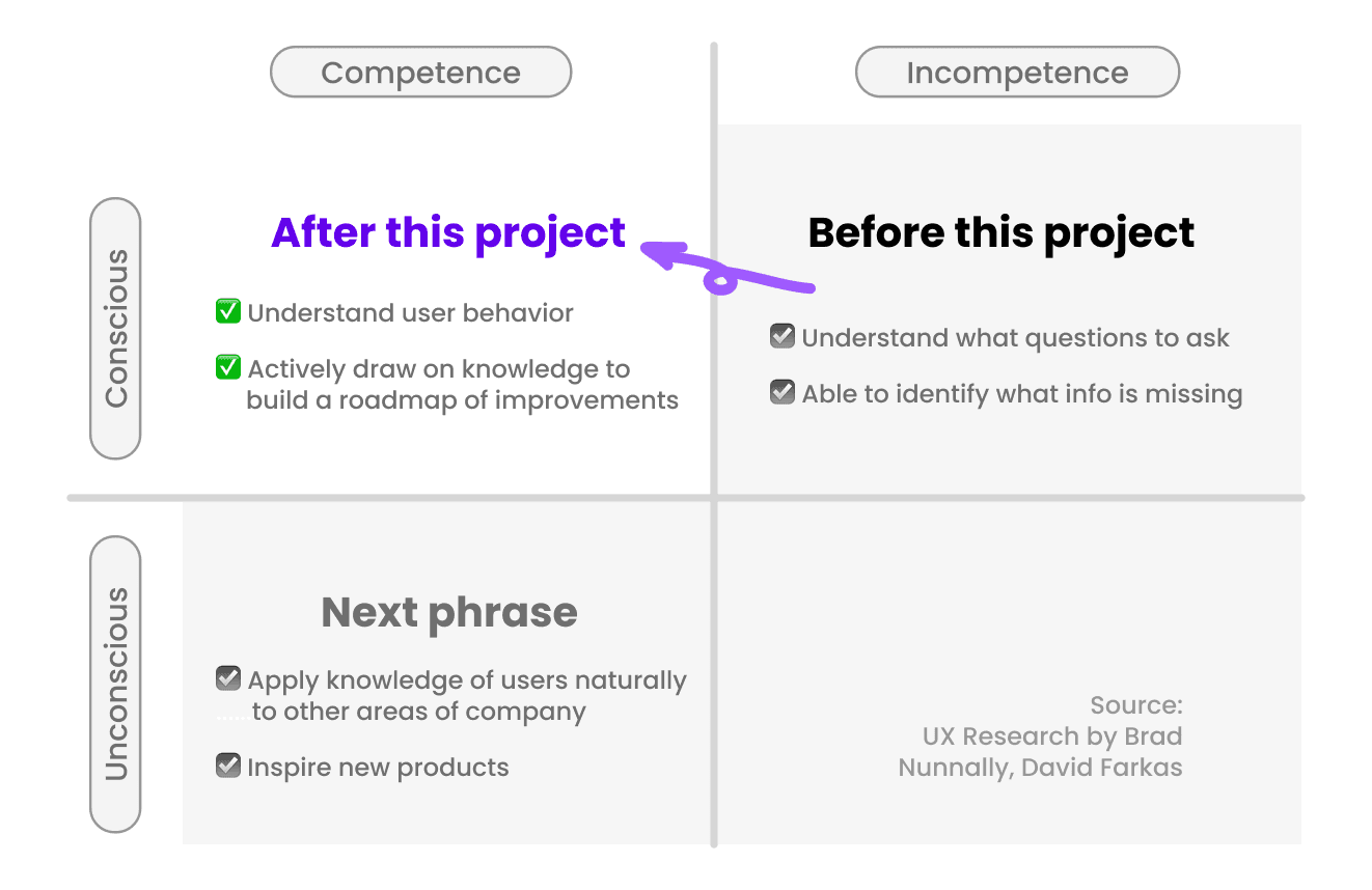
Through this project, we identified areas to expand our knowledge of users.
Through this project, we identified areas to expand our knowledge of users.
Through this project, we identified areas to expand our knowledge of users.
Based on these findings, we planned further research for the next two quarters, including a heuristic evaluation to assess the usability of 2B-facing, counterpart features and make improvements.
Based on these findings, we planned further research for the next two quarters, including a heuristic evaluation to assess the usability of 2B-facing, counterpart features and make improvements.
Based on these findings, we planned further research for the next two quarters, including a heuristic evaluation to assess the usability of 2B-facing, counterpart features and make improvements.


Research Limitations and Reflection
Research Limitations and Reflection
Research Limitations and Reflection
Limitations on resources due to time-bounded project scope
Limitations on resources due to time-bounded project scope
Limitations on resources due to time-bounded project scope
Need of expand focus on merchant perspectives
Further discussion with existing and potential clients is needed to explore merchant preferences regarding the proposed design elements.
Need of expand focus on merchant perspectives
Further discussion with existing and potential clients is needed to explore merchant preferences regarding the proposed design elements.
Need of expand focus on merchant perspectives
Further discussion with existing and potential clients is needed to explore merchant preferences regarding the proposed design elements.
Limited participant pool
Recruiting enough number of real buyers and testing in a more natural environment (e.g., user homes) in the next phase will facilitate generalizability of the findings.
Limited participant pool
Recruiting enough number of real buyers and testing in a more natural environment (e.g., user homes) in the next phase will facilitate generalizability of the findings.
Limited participant pool
Recruiting enough number of real buyers and testing in a more natural environment (e.g., user homes) in the next phase will facilitate generalizability of the findings.
My learnings
My learnings
My learnings
Aligning Research and Proposal
UX researcher needs to ensure the proposed design aligns with the secondary research goals when communicating with the designers.
Seek clarification on the overall direction, instead of only focusing heavily on the details.
Aligning Research and Proposal
UX researcher needs to ensure the proposed design aligns with the secondary research goals when communicating with the designers.
Seek clarification on the overall direction, instead of only focusing heavily on the details.
Aligning Research and Proposal
UX researcher needs to ensure the proposed design aligns with the secondary research goals when communicating with the designers.
Seek clarification on the overall direction, instead of only focusing heavily on the details.
Impactful cross-functional collaboration
Involve PMs early in the research process is the juncture to ensure alignment with product vision and roadmap.
Also, collaboration between colleagues from Hong Kong required us to practice active listening and clear documentation on Figma.
Impactful cross-functional collaboration
Involve PMs early in the research process is the juncture to ensure alignment with product vision and roadmap.
Also, collaboration between colleagues from Hong Kong required us to practice active listening and clear documentation on Figma.
Impactful cross-functional collaboration
Involve PMs early in the research process is the juncture to ensure alignment with product vision and roadmap.
Also, collaboration between colleagues from Hong Kong required us to practice active listening and clear documentation on Figma.
Special Shoutouts—
Jacob, UX Manager
Joan, Product Manager
Cora, UX Designer
Cammy, UX Designer
Special Shoutouts—
Jacob, UX Manager
Joan, Product Manager
Cora, UX Designer
Cammy, UX Designer
Special Shoutouts—
Jacob, UX Manager
Joan, Product Manager
Cora, UX Designer
Cammy, UX Designer
Next Project
Next Project
Decrease drop off rate by 34.8% of B2B payment product
Decrease drop off rate by 34.8% of B2B payment product
Decrease drop off rate by 34.8% of B2B payment product
View Project →
View Project →
View Project →


Beatrice HU
Beatrice HU
Beatrice HU
