
Virtual & physical experience
for international ice rink
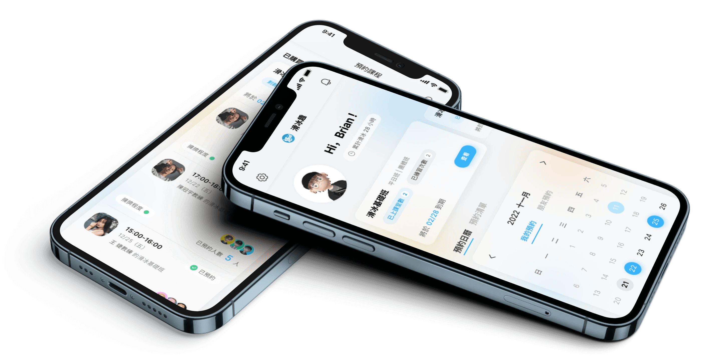
Expected Impact
50% less costs, 10x more profits, and higher customer loyalty
Role
UI, UX Strategy, PM
Time
Sep - Nov 2022

The existing experience prevents people from signing up the courses
The current mechanism forces on-site / phone call registration and offers scattered information to choose a coach and prepare their gears beforehand.
But we can ditch on-site registration & paperwork now
✨ Our ice skating app simplifies everything. ✨
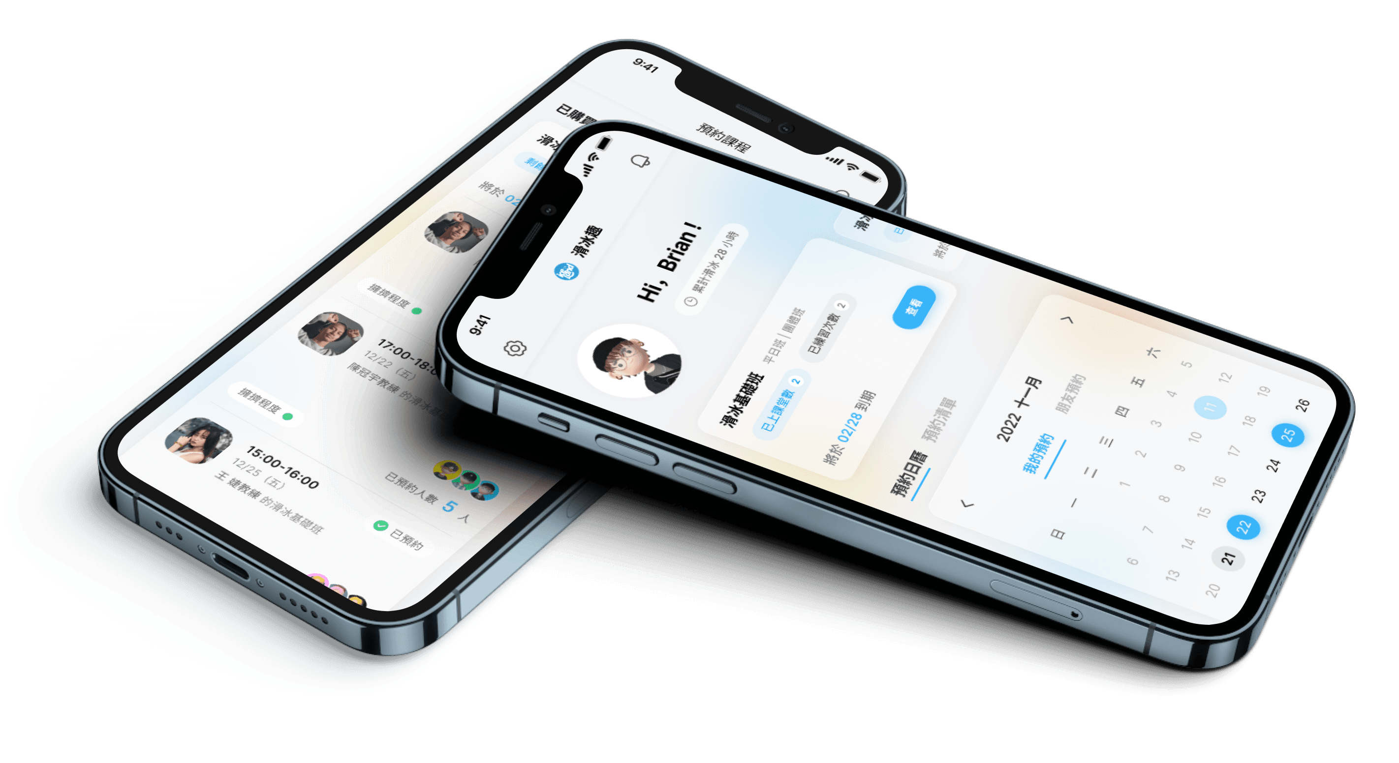
Register courses online, find beginner equipment guides, and access all info in one place. The app goes beyond lessons with informed choices, clear guidance, and the perfect coach connection, embracing a confident learning journey.
Inter
Typography
Design system
Our light blue color scheme, with a touch of opacity, evokes the refreshing feeling of ice while maintaining crystal-clear text and UI elements.
400
#36B3FA
Swatch Base
#FFFFFF
700
#000000
300
#F68D3B
300
#F9D441
300
#32D583


So, what did we do?
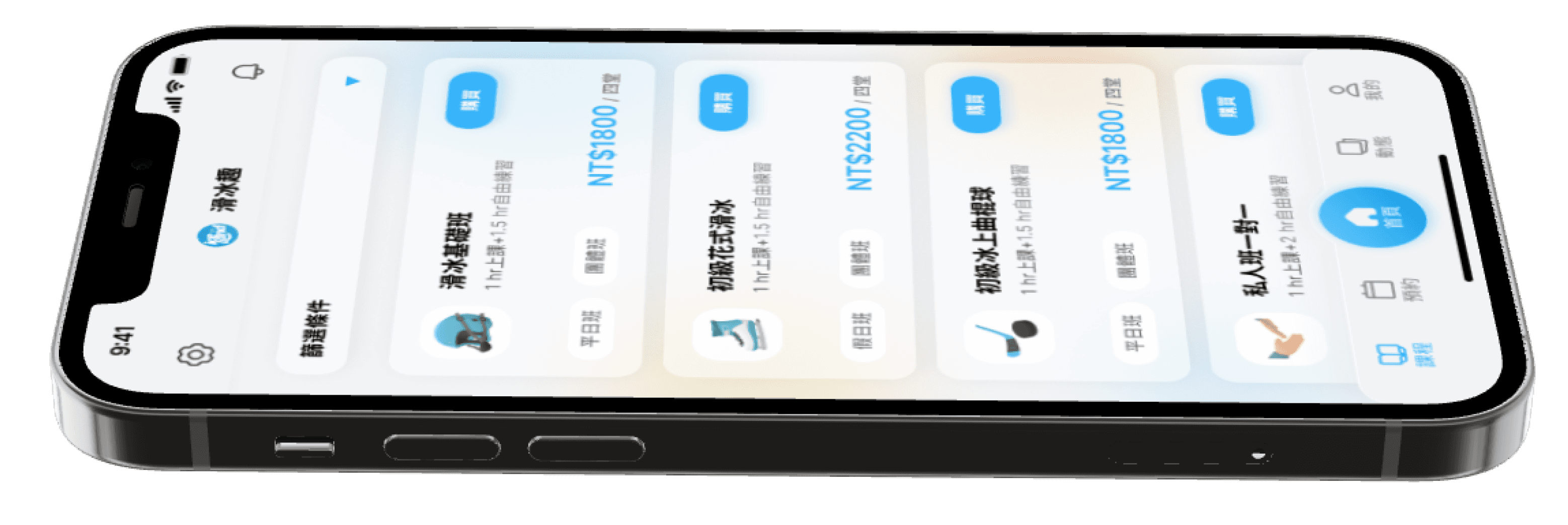
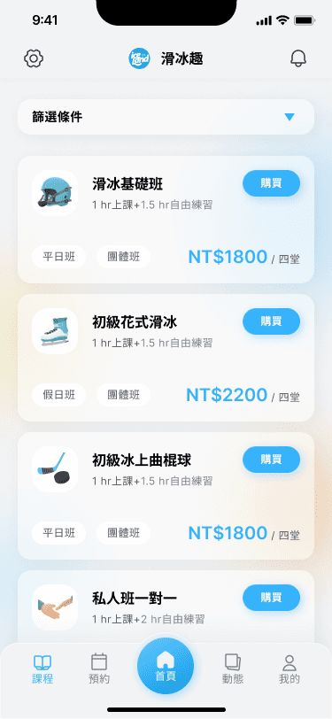
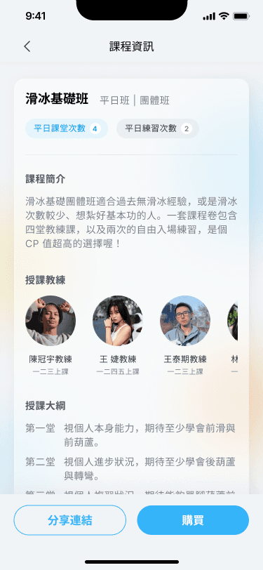
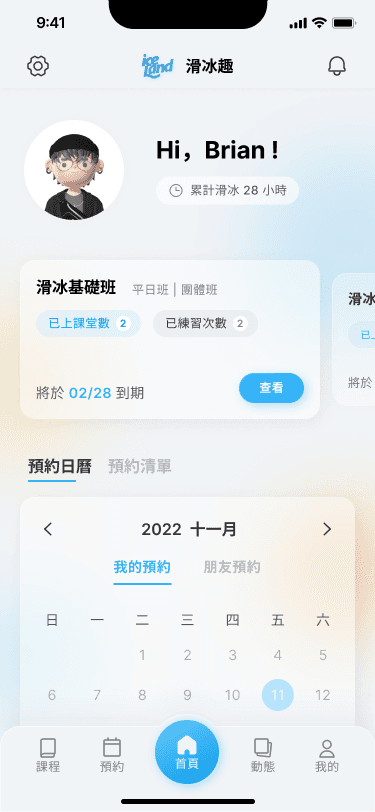
Clear info for newbie skaters
Reduces information overload during enrollment by surfacing the most important facts upfront based on the in-depth interview data (n=8).
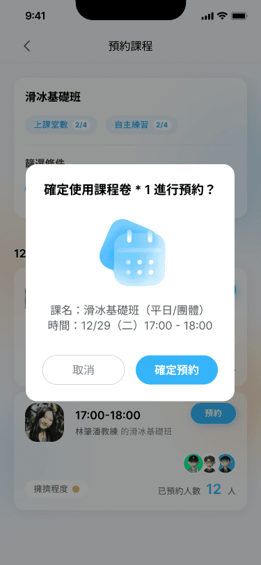
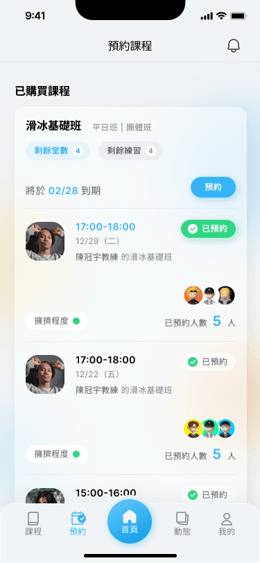
Reserve & schedule lessons with ease
Eliminating phone calls and on-site scheduling, the app empowers users to view remaining lessons, pre-arrange sessions with preferred coaches based on friend availability, and access all information seamlessly in a single view.
Foster passion with community
Visualize the class schedule and connect with friends, new and old, to attend sessions together.


Before
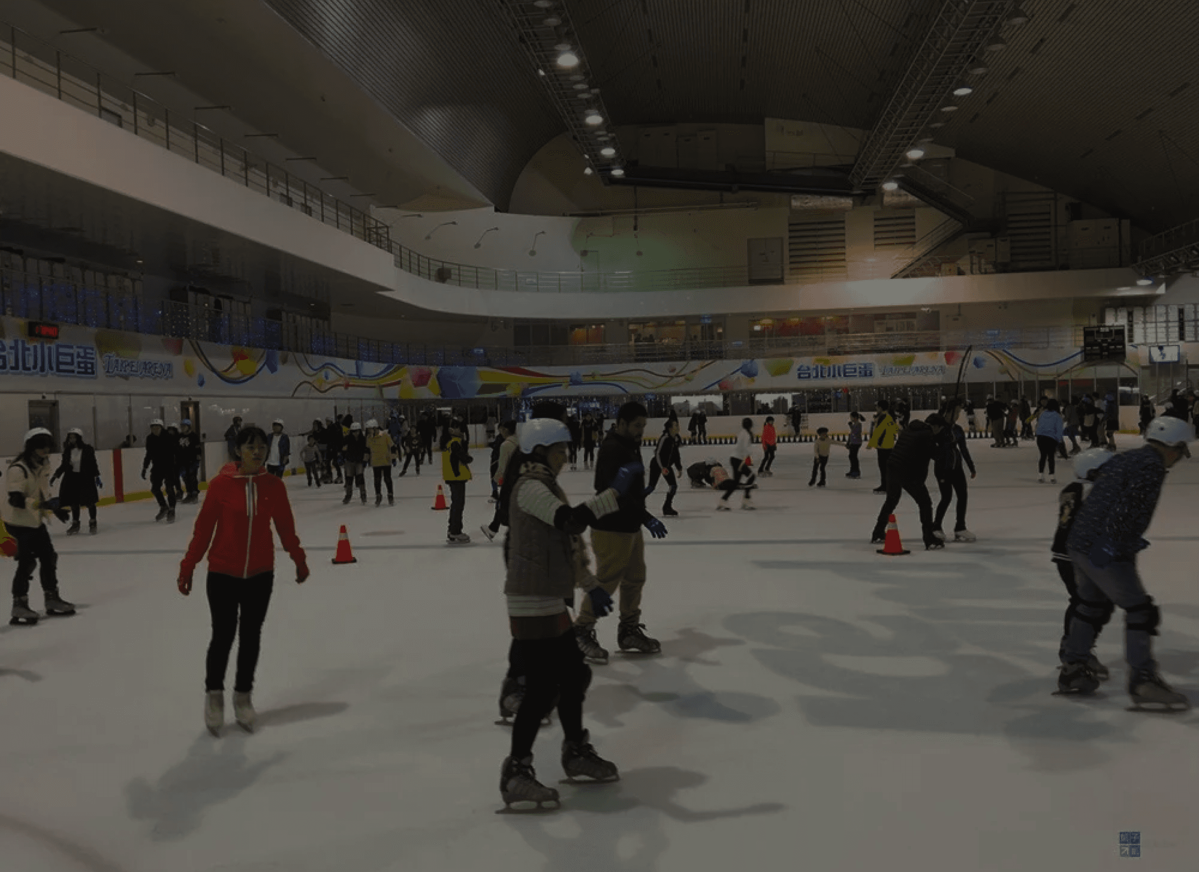
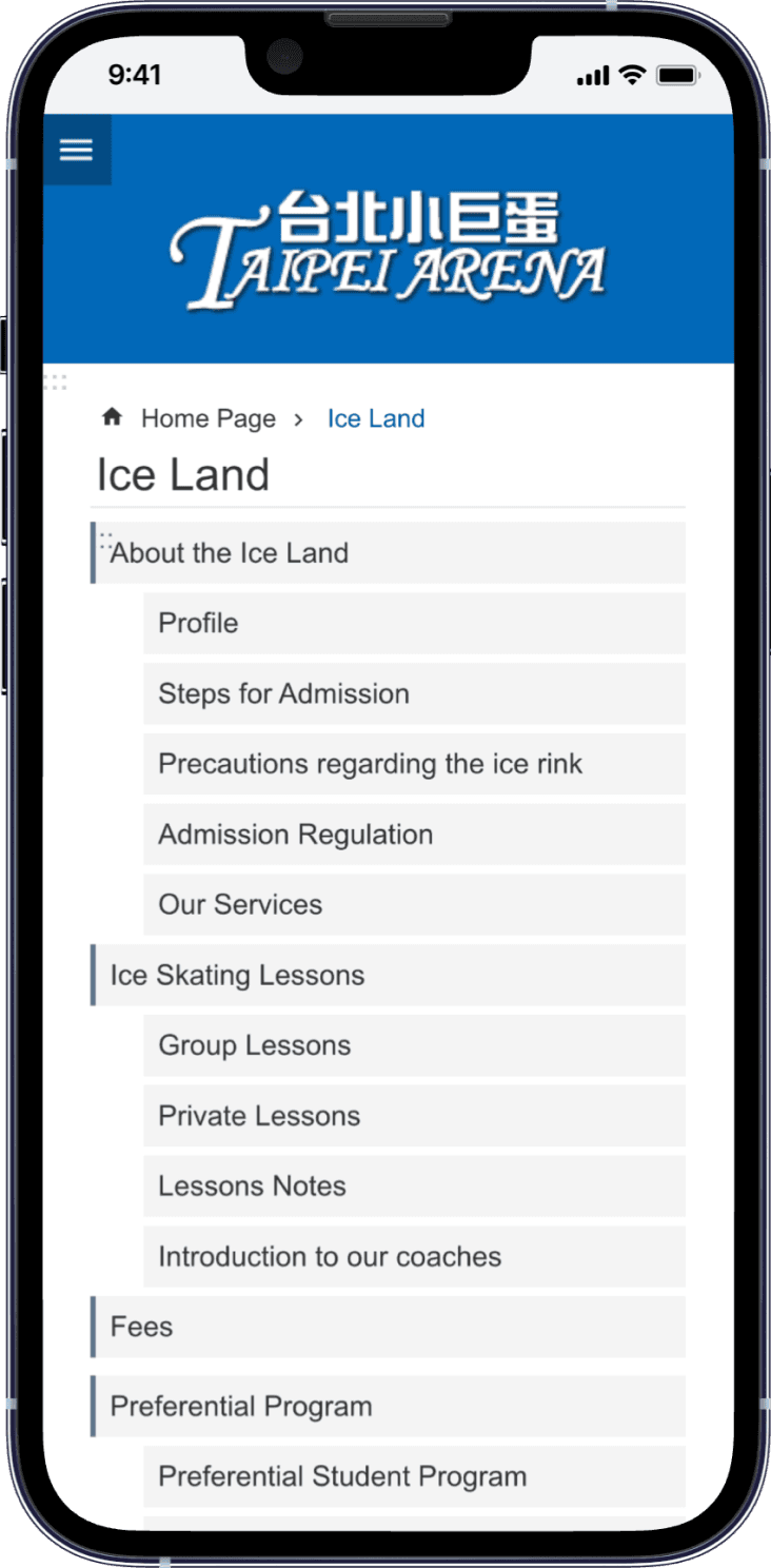
Unexpected crowdedness
Scattered and lagging info
Lack of retention mechanism
After
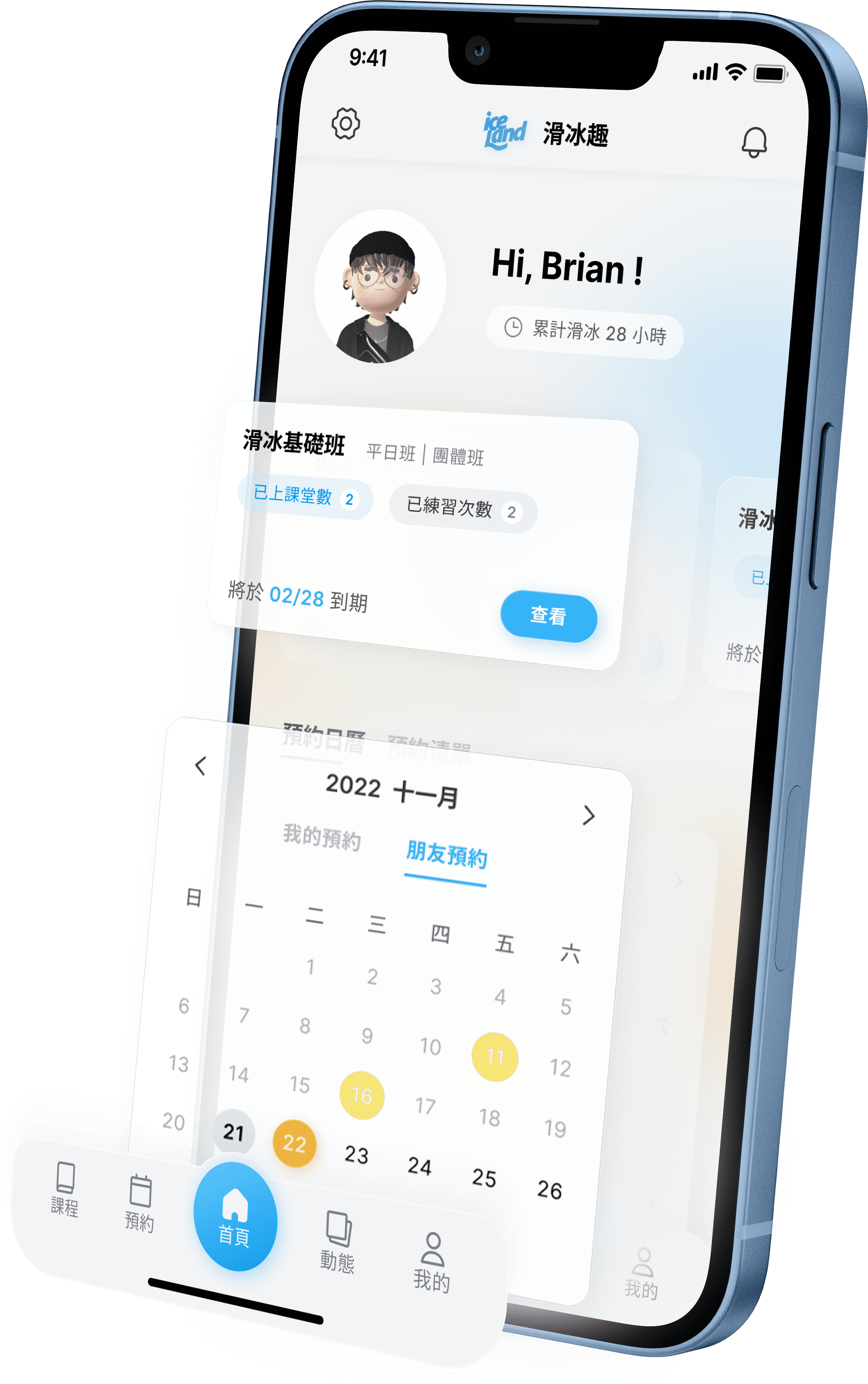
Congestion level shown beforehand
Neat course details
Join sessions with new and exsisting friends
Expected outcomes include...
📉 50% less costs
Automating manual, paper-based processes through our app reduces errors, saves time, and lowers operational costs.
The streamlined workflows also frees up resources to focus on strategic initiatives that drive business growth.
📈 10x more profits
Foster a thriving community by enabling skaters to come with friends, boosting conversion & retention rates.
That also empowers flexible pricing strategies for targeted promotions, maximizing revenue opportunities.
🤩 customer loyalty
Our app help forge lasting bonds with skaters through streamlined registration and dashboards to review their own learning progress.
Unified skating experience also solidify the brand image and loyalty.
Special Shoutouts—
Yuu Yang, Brand & Visual Designer
Myra Chen, UX Designer
Wendy Tsai, UX Designer
Beatrice HU

Virtual & physical experience for international ice rink

Expected Impact
50% less costs, 10x more profits, and higher customer loyalty
Role
UI, UX Strategy, PM
Time
2022 Sep. - Nov.


The existing experience prevents people from signing up the courses.
The current mechanism forces on-site / phone call registration and offers scattered information to choose a coach and prepare their gears beforehand.
But we can ditch on-site registration & paperwork now ✨
Our ice skating app simplifies everything.
Register courses online, find beginner equipment guides, and access all info in one place. The app goes beyond lessons with informed choices, clear guidance, and the perfect coach connection, embracing a confident learning journey.
Inter
Typography
Design system
Our light blue color scheme, with a touch of opacity, evokes the refreshing feeling of ice while maintaining crystal-clear text and UI elements.
400
#36B3FA
Swatch Base
#FFFFFF
700
#000000
300
#F68D3B
300
#F9D441
300
#32D583


So, why does it matter?


Clear info for newbie skaters
Reduces information overload during enrollment by surfacing the most important facts upfront based on the in-depth interview data (n=8).


Reserve & schedule lessons with ease
Eliminating phone calls and on-site scheduling, the app empowers users to view remaining lessons, pre-arrange sessions with preferred coaches based on friend availability, and access all information seamlessly in a single view.
Foster passion with community
Visualize the class schedule and connect with friends, new and old, to attend sessions together.


Before


Unexpected crowdedness
Scattered and lagging info
Lack of retention mechanism
After


Congestion level shown beforehand
Neat course details
Join sessions with new and exsisting friends
Expected outcomes include...
📉 50% less costs
Automating manual, paper-based processes through our app reduces errors, saves time, and lowers operational costs.
The streamlined workflows also frees up resources to focus on strategic initiatives that drive business growth.
📈 10x more profits
Foster a thriving community by enabling skaters to come with friends, boosting conversion & retention rates.
That also empowers flexible pricing strategies for targeted promotions, maximizing revenue opportunities.
🤩 customer loyalty
Our app help forge lasting bonds with skaters through streamlined registration and dashboards to review their own learning progress.
Unified skating experience also solidify the brand image and loyalty.
Special Shoutouts—
Yuu Yang, Brand & Visual Designer
Myra Chen, UX Designer
Wendy Tsai, UX Designer
Beatrice HU
Beatrice HU
Virtual & physical experience for international ice rink


Expected Impact
50% less costs, 10x more profits, and higher customer loyalty
Role
UI, UX Strategy, PM
Time
2022 Sep. - Nov.


The existing experience prevents people from signing up the courses.
The current mechanism forces on-site / phone call registration and offers scattered information to choose a coach and prepare their gears beforehand.
But we can ditch on-site registration & paperwork now ✨
Our ice skating app simplifies everything.
Register courses online, find beginner equipment guides, and access all info in one place. The app goes beyond lessons with informed choices, clear guidance, and the perfect coach connection, embracing a confident learning journey.
Inter
Typography
Design system
Our light blue color scheme, with a touch of opacity, evokes the refreshing feeling of ice while maintaining crystal-clear text and UI elements.
400
#36B3FA
Swatch Base
#FFFFFF
700
#000000
300
#F68D3B
300
#F9D441
300
#32D583


So,
why does it matter?


Clear info for newbie skaters
Reduces information overload during enrollment by surfacing the most important facts upfront based on the in-depth interview data (n=8).


Reserve & schedule lessons with ease
Eliminating phone calls and on-site scheduling, the app empowers users to view remaining lessons, pre-arrange sessions with preferred coaches based on friend availability, and access all information seamlessly in a single view.
Foster passion with community
Visualize the class schedule and connect with friends, new and old, to attend sessions together.


Before


Unexpected crowdedness
Scattered and lagging info
Lack of retention mechanism
After


Congestion level shown beforehand
Neat course details
Join sessions with new and exsisting friends
Expected outcomes include...
📉 50% less costs
Automating manual, paper-based processes through our app reduces errors, saves time, and lowers operational costs.
The streamlined workflows also frees up resources to focus on strategic initiatives that drive business growth.
📈 10x more profits
Foster a thriving community by enabling skaters to come with friends, boosting conversion & retention rates.
That also empowers flexible pricing strategies for targeted promotions, maximizing revenue opportunities.
🤩 customer loyalty
Our app help forge lasting bonds with skaters through streamlined registration and dashboards to review their own learning progress.
Unified skating experience also solidify the brand image and loyalty.
Special Shoutouts—
Yuu Yang, Brand & Visual Designer
Myra Chen, UX Designer
Wendy Tsai, UX Designer
Beatrice HU
Beatrice HU
